
The Giving Company
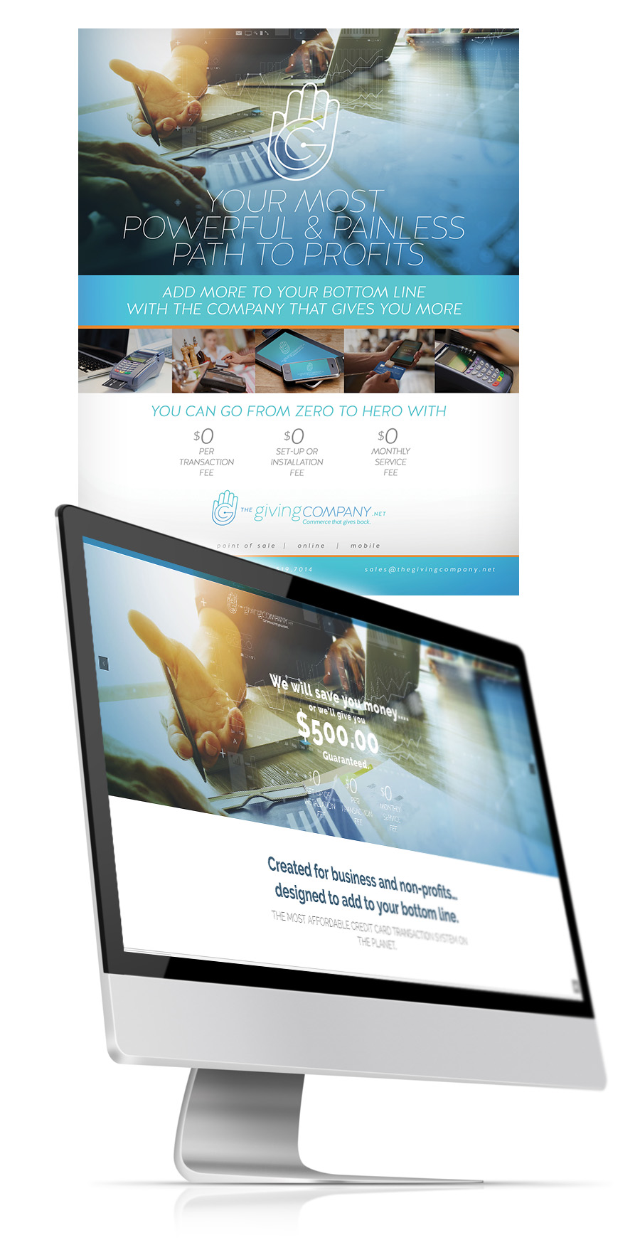
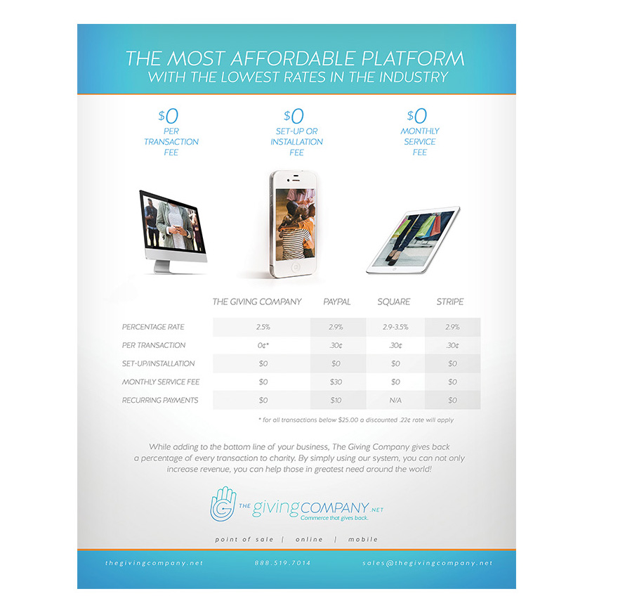
CHALLENGE: The multi-billion dollar industry that is the modern payment processing system used by millions of merchants worldwide is signified by wild profit margins and volatile, ever-changing rate swings and wildly fluctuating fee structures and confusing messaging. After seeing the financial impact of current digital payment solutions available to churches, non-profits and corporations today, The Giving Company committed to creating new, cost-effective solutions. Their added value was the actual giving feature - a portion of each transaction will be donated to charity.
So the challenge became how to present the unique processing systems put in place by the giving company, and at the same time explain the giving aspect of their business model. The very simplicity of their processes in the midst of such information overload was a challenge. How to convey that The Giving Company now offers the most affordable - and intuitive - Merchant Account System in the industry...AND gives back? An interesting conundrum, for sure.
An additional challenge in this project was the very specific technology solutions required for the company website. Site guest information. Potential client application and follow up. Client portal. Payment processing dashboard. Multi-layer security. All these and many more features were absolute necessities to be included.
SOLUTION: Considering the current industry standards and the wild mix of messaging one encounters, it was important to develop targeted messaging including a logo that instantly, visually conveyed the difference between The Giving Company and the many other payment processing options in the marketplace. It was equally important that the focus on giving back not be lost in the mix.
The creative direction was ultimately anchored by the logo comprised of an uncomplicated icon of a raised hand with a G ("Giving") in center focus. This icon not only suggested the viewer stop to inquire further but created a connection with the giving hand of charity. Presenting such a unique product yet avoiding unbelievable hyperbole led the creative staff in their journey to select just the right imagery and tagline to meld with the logo icon.